Country: Zimbabwe
Theme: The Importance of Environment and Wildlife Through Traditional Culture
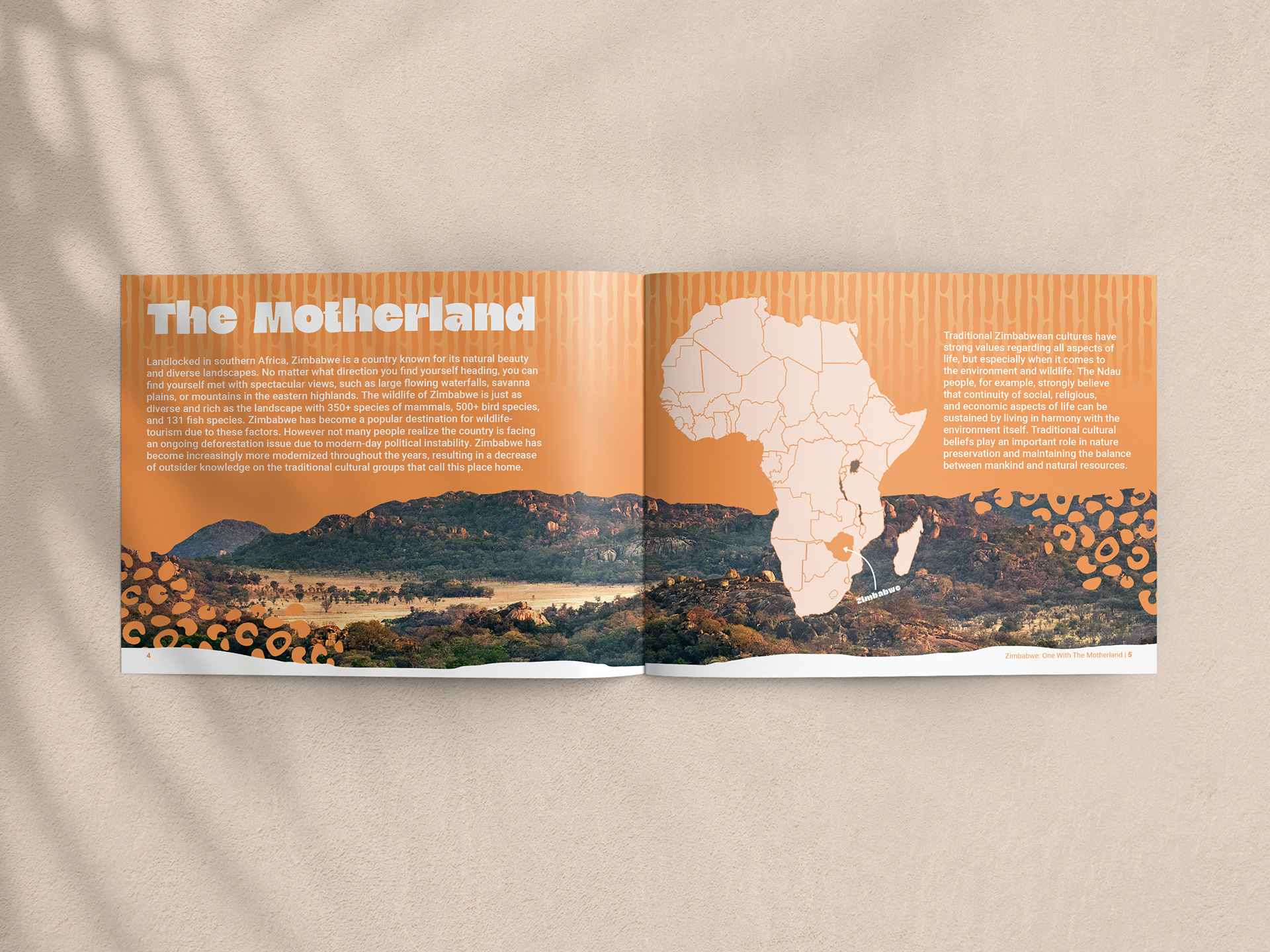
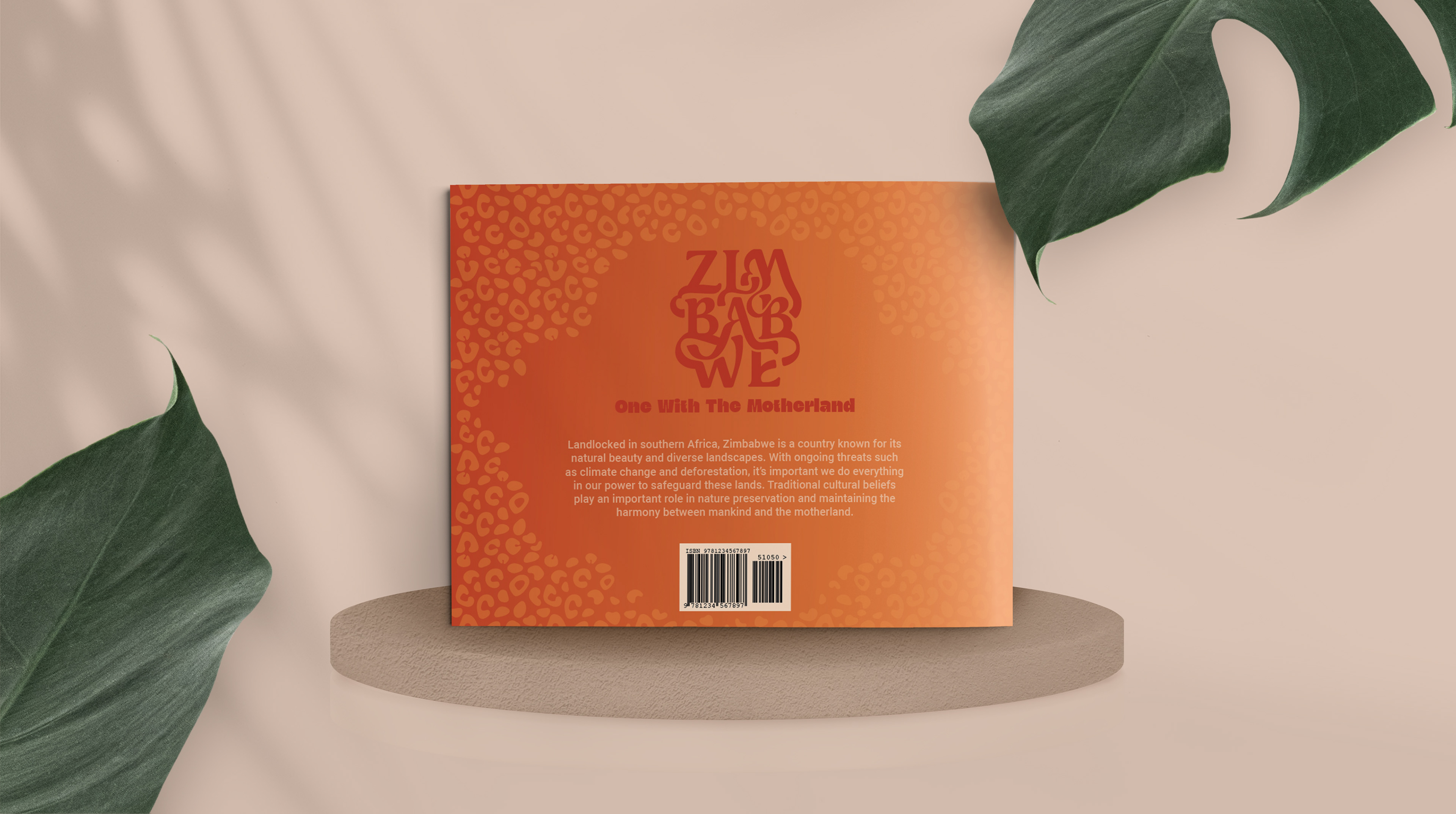
Zimbabwe is a country known for its natural beauty and diverse landscapes. Traditional cultural beliefs play an important role in nature preservation and maintaining the harmony between mankind and the motherland.
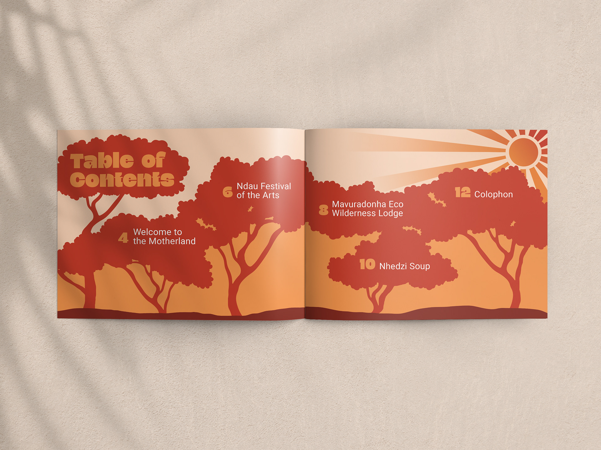
Topics: Event, Food, Location
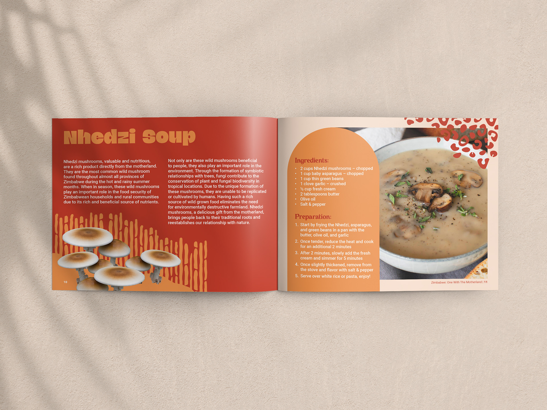
Ndau Festival of the Arts (Event), Nhedzi Soup (Food), Mavuradonha Eco Wilderness Lodge (Location)
Process Work
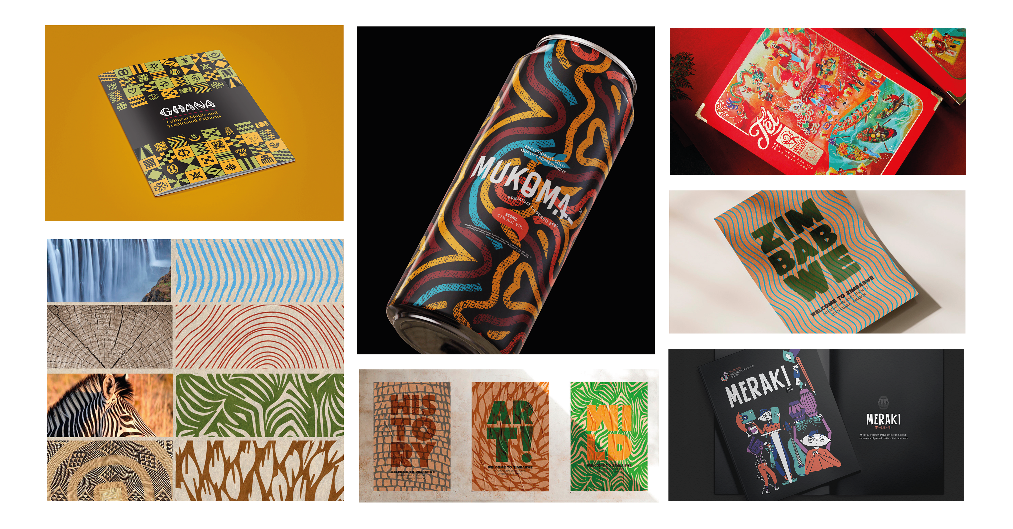
Mood Board
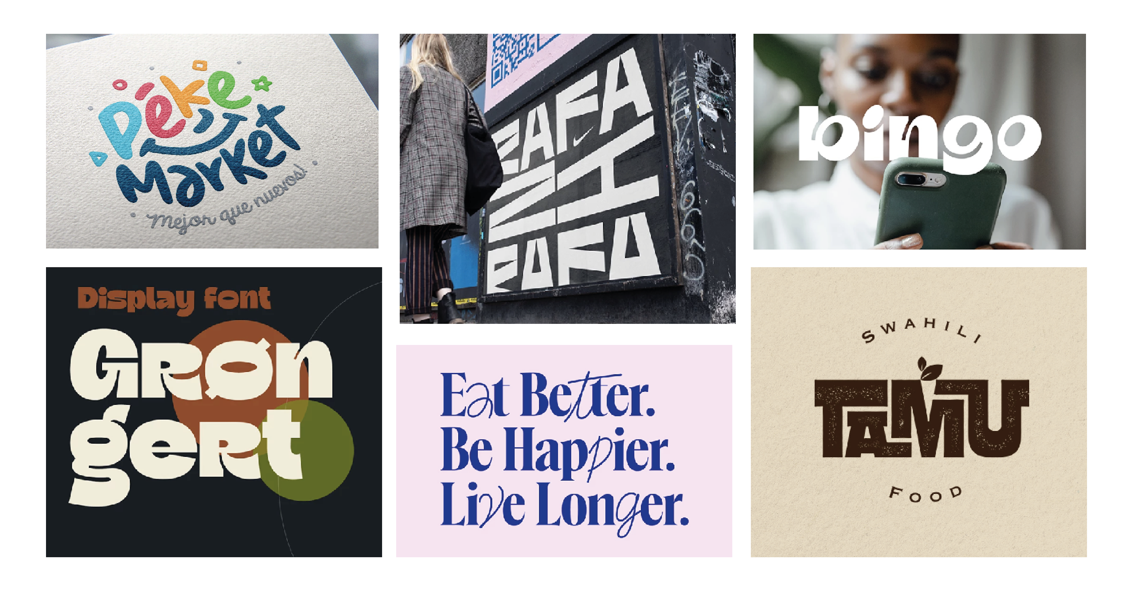
Typography Mood Board
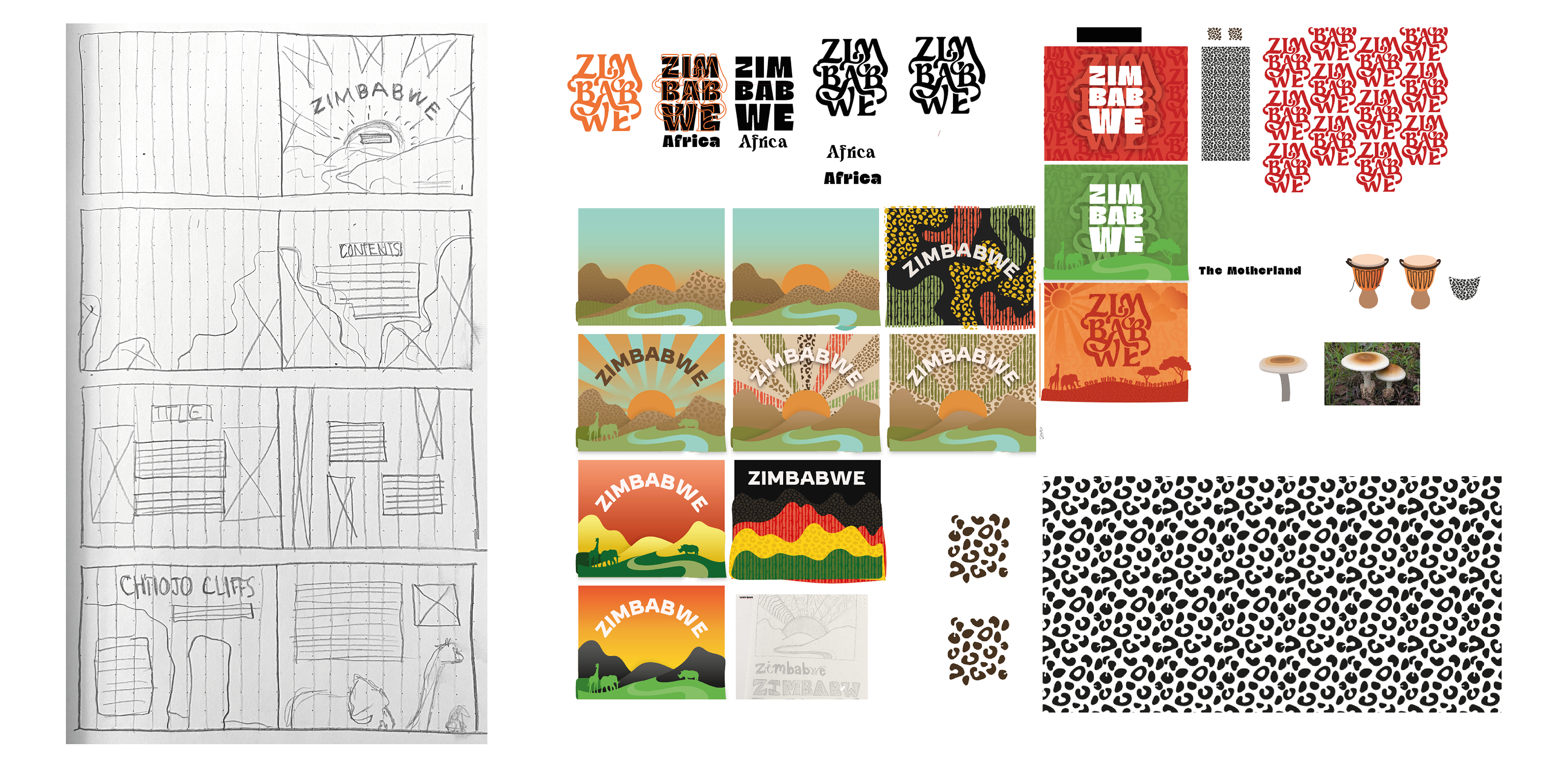
All of the featured examples effectively integrate patterns, textures, or unique illustration styles that complement their respective themes. For instance, natural patterns are employed as inspiration for the designs seen in the bottom left corner, which are then consistently utilized throughout other examples, including the bottom-middle and right-middle. Similarly, the objective for the Zimbabwe book was to incorporate textures and patterns that are thematically cohesive and visually compelling.
The objective was to find a typeface that conveyed both boldness and strength, while also incorporating natural curves or roughness to reflect the essence of nature. The chosen typeface needed to possess an organic quality, which was a key theme discussed in the book, centered around the nature preserve and its diverse wildlife. As evident from the various typeface options considered, each one exuded its own unique characteristics and distinctive qualities.
thumbnail sketches
Designed Assets in Illustrator
The images above show the beginning of thumbnail sketches as well as where things began to develop and be designed in Adobe Illustrator. On the left are sketches of the original layout idea. These preliminary sketches were the beginning stage to develop grid structure, layout variations, and composition in Adobe InDesign. Although the final design does not look much like the original sketches, it gives great insight into how the design progressed and improved. The snapshot to the right shows the process of coming up with the cover page design, cover page typography, and patterns. These were all created using Adobe Illustrator.
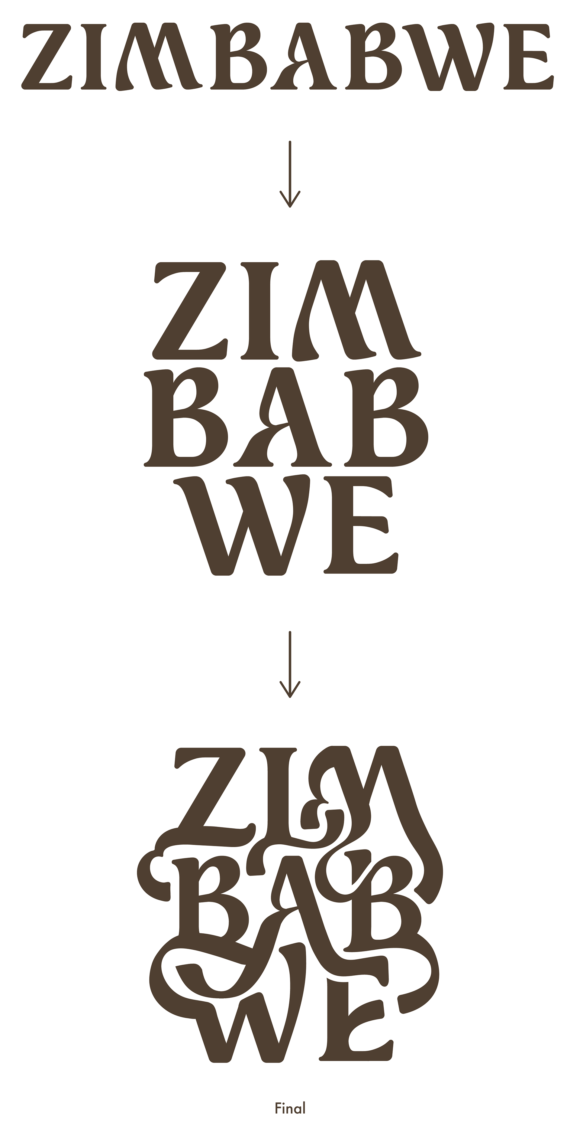
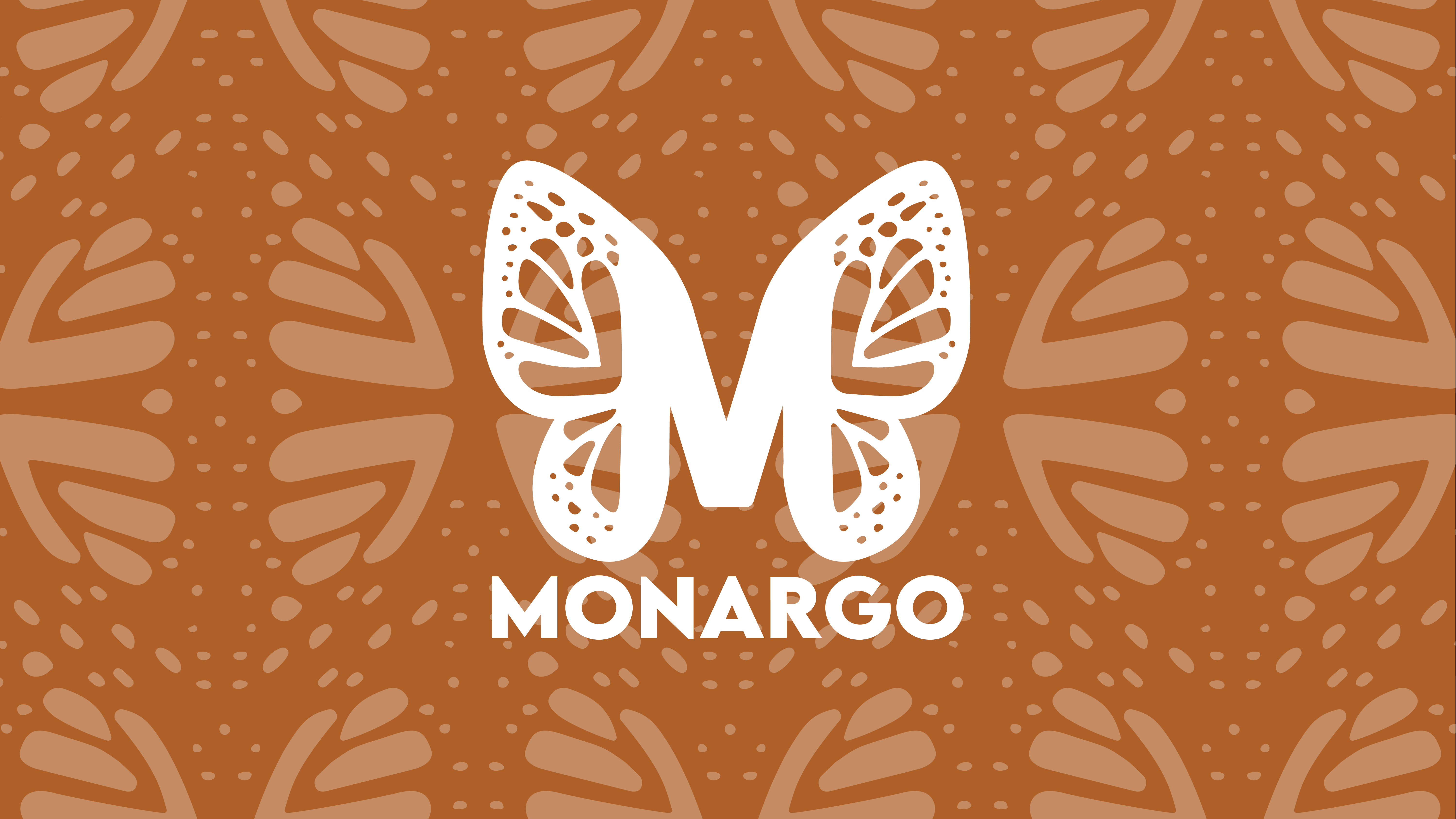
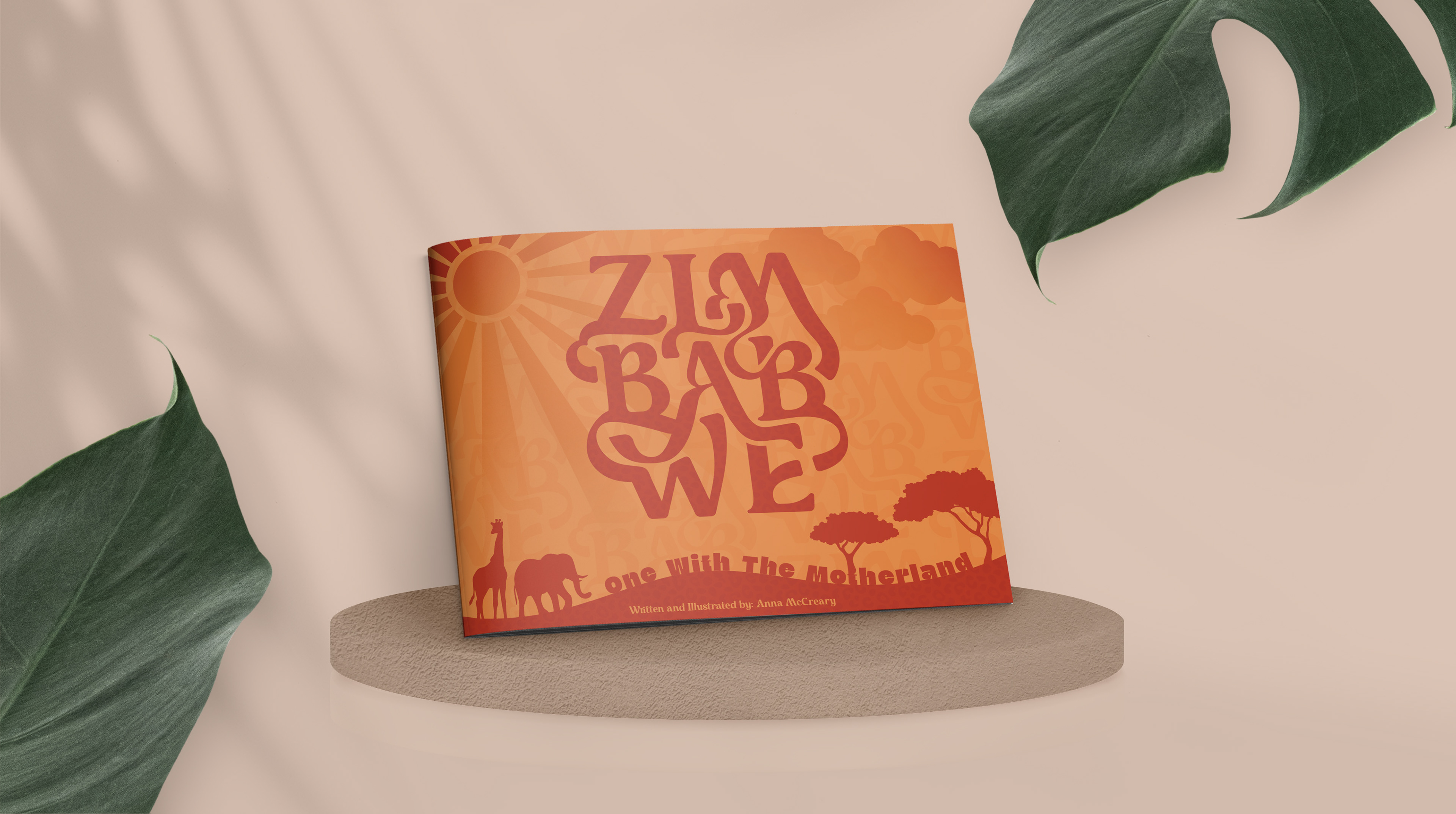
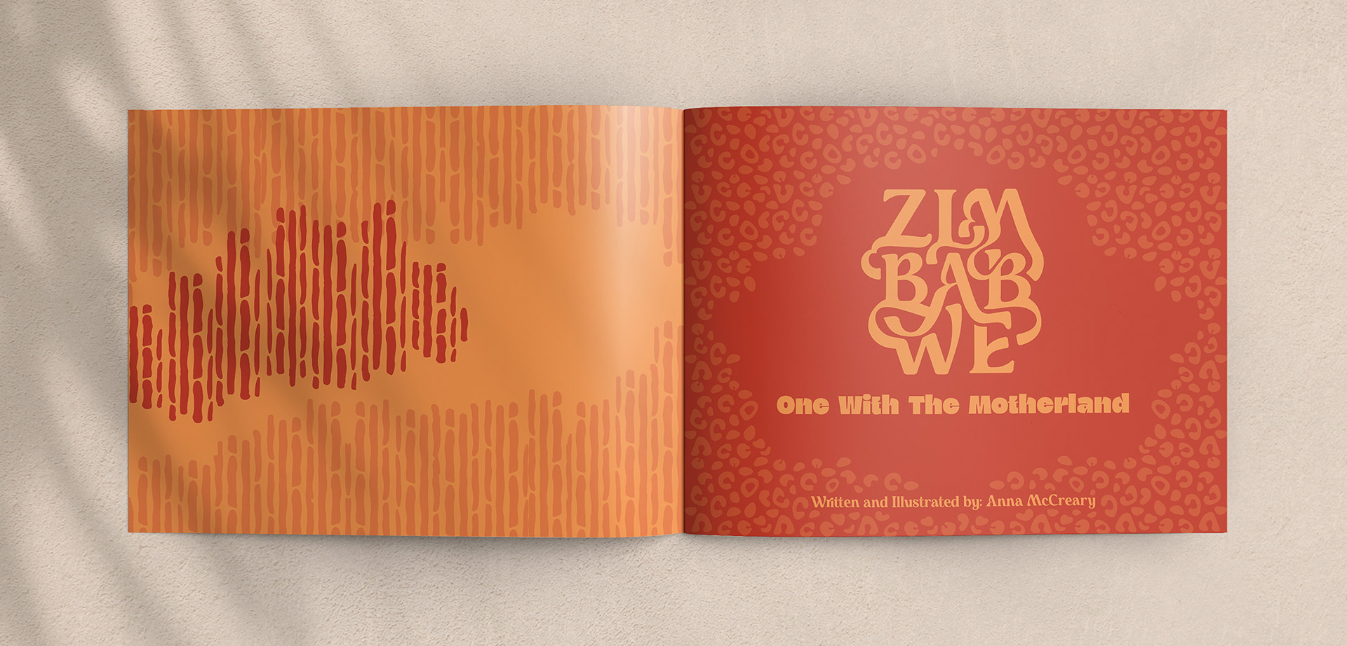
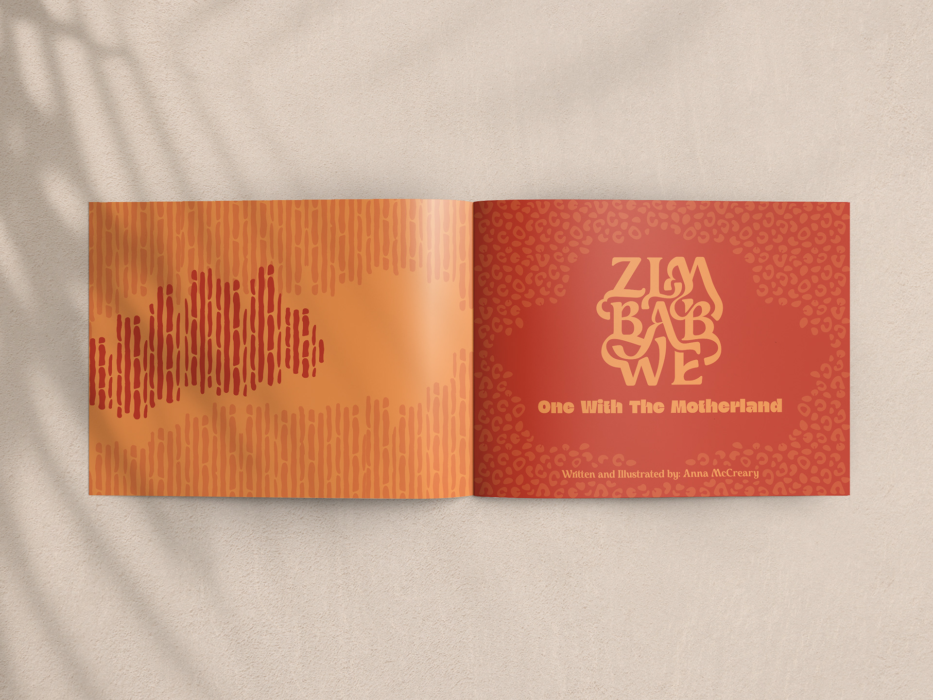
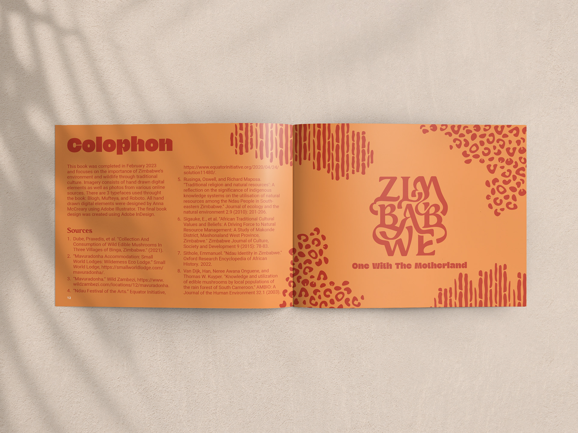
The custom "Zimbabwe" letter form used in the book was not just a mere choice of font, but a well-thought-out design that took meticulous effort to create. The Mufteya typeface was utilized as a base and modified to fit the book's theme and message.
The process involved stacking the letters in a row of three to achieve a more vertical orientation. The next step was transforming the text into shapes, which were then meticulously customized by hand. The alteration to the typography highlighted the elegant curves of the font and introduced organic, free-flowing shapes. These shapes filled the white space in a visually appealing manner, creating a stunning and unique design.
The organic flow of the shapes symbolizes the natural beauty and vitality of Zimbabwe, while the connection between the letter forms represents the unity and harmony of the country's people. The letter form not only captures the essence of the book's subject matter but also serves as a visual representation of the connection between nature and the culture of Zimbabwe.
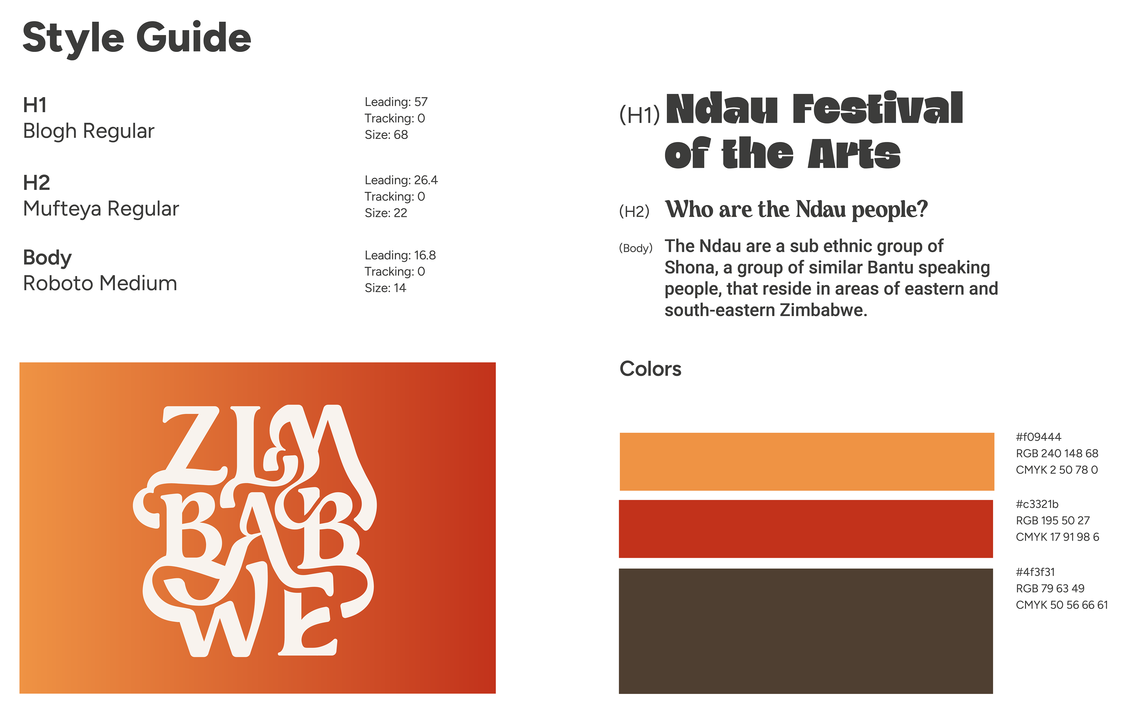
The style guide above shows the typography and color choices that were used to develop Zimbabwe: One With The Motherland. Heading 1 is using Blogh Regular: a strong sans serif display, and heading 2 is Mufteya Regular: a unique serif font with organic curves. Both of these typefaces were purchased specifically for this project. The typography used for the body copy is Roboto Medium. To the right of the listed typefaces is an example of what the typography paired together.
Located at the bottom of the style guide is the color scheme as well as the custom "Zimbabwe" used on the cover page. It was important to use warm and organic colors to reflect the Nature theme of the book.
Final Design
The final book design is a harmonious blend of strong colors, stylized typography, and custom illustrations, seamlessly woven together to create a cohesive and visually stunning reading experience. The use of patterns and imagery, combined with organic shapes, adds texture and movement to every spread. The overall design exudes a playful and youthful energy that makes it enjoyable for readers of all ages.
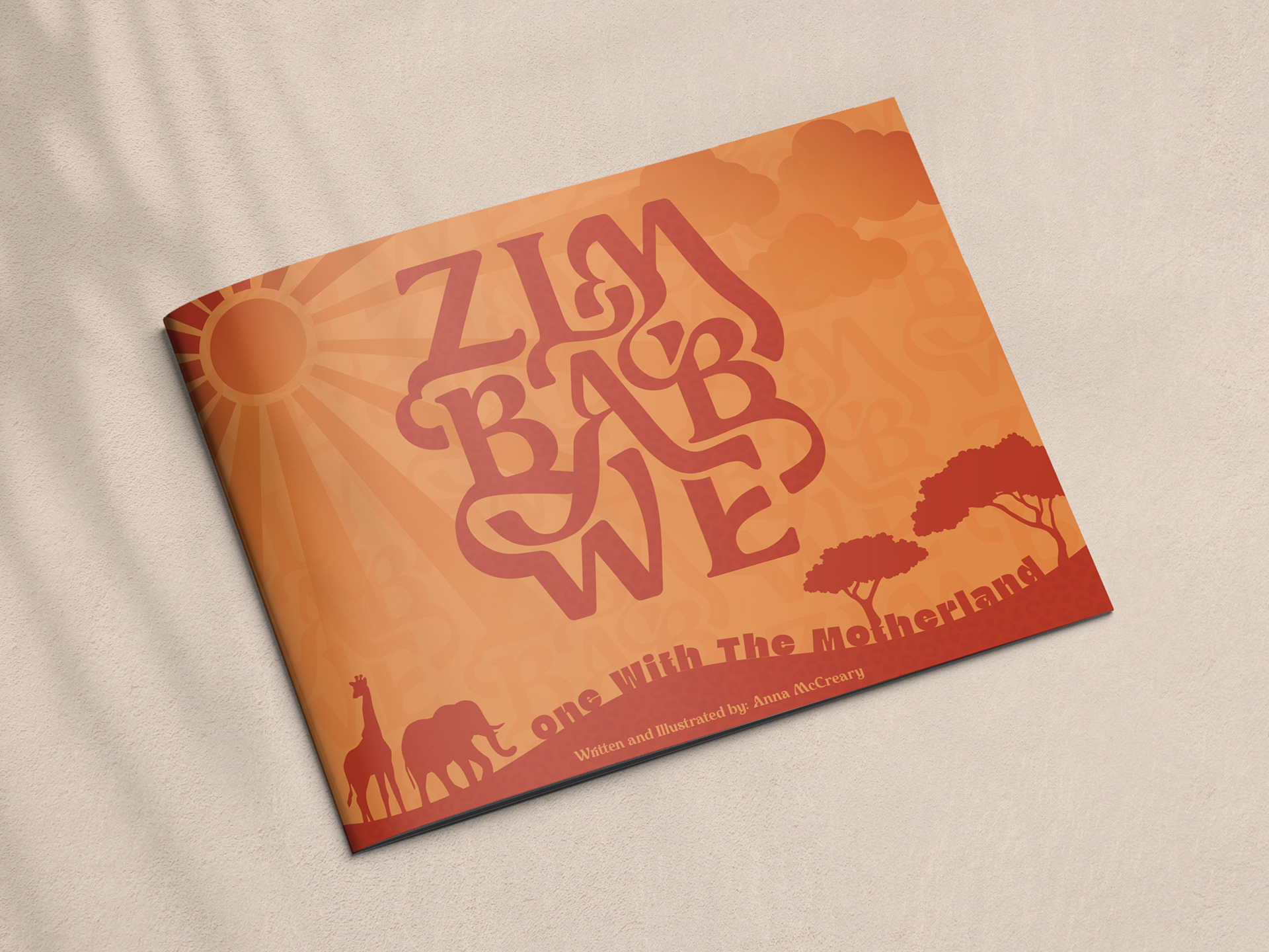


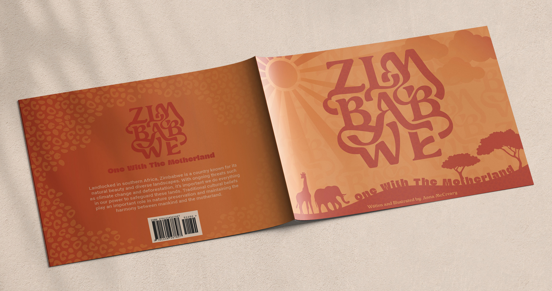
Designed, Illustrated, and Written by Anna McCreary
Programs Used:
Adobe InDesign - Book Layout
Adobe Illustrator - Custom Typography and Illustrations
Adobe Photoshop - Mockups