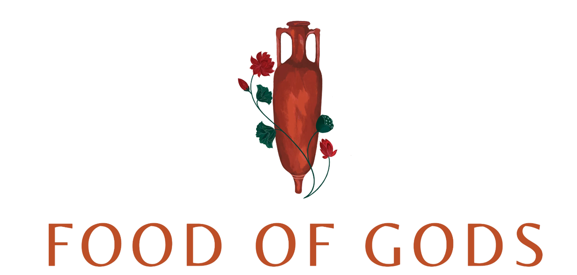
My team and I at Studio 165+ worked to re-design a logo for an international client, Food of Gods. Food of Gods is a spice company whose mission is to build a healthier & nutritious food system. The objective was to develop a logo that not only reflected the history, culture, and values of the brand but also encapsulated its key values of purity, eternity, honesty, heirloom, and originality. We recognized the importance of building a logo that truly represented the Food of Gods brand and everything it stands for.
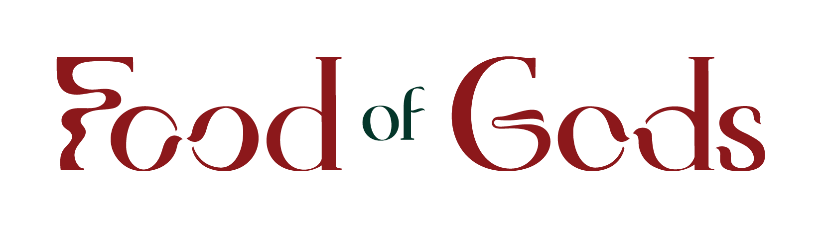
Original Logo
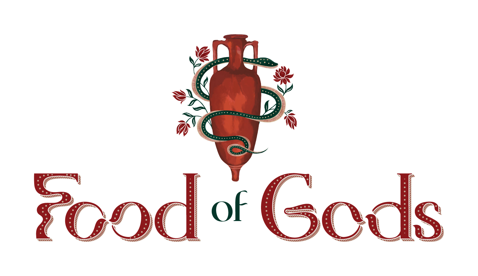
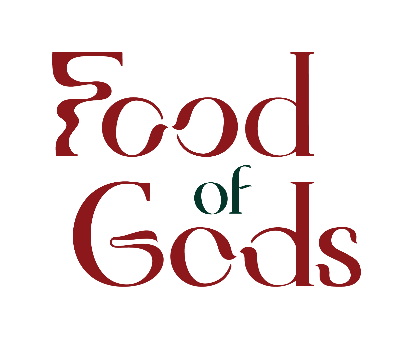
Re-designed Logo
The images on the left show the original logo (top) and the re-designed logo (bottom). To achieve a logo that represented what the brand stands for, we drew inspiration from the Food of Gods icon. We incorporated elements of the lotus and amphorae to create a concept that is both unique and relevant to the brand. By using the shapes of lotus petals to form the ends of the O's and D's within the type, we were able to mirror the beauty and symbolism of the lotus flower, representing purity and eternity.
Additionally, we wanted to showcase the journey of the spices and the prosperity of the brand by joining the O's. The O and D show different elements coming together just like spices from different countries and cultures.
To add another layer of meaning to the logo, the G symbolizes a serpent, which represents regeneration, human-to-earth connection, and healing. Finally, the serifs were designed to mimic the handle of the amphorae, adding an extra touch of elegance to the overall design.
Overall, the final logo effectively represents the Food of Gods brand, highlighting its rich culture while also showcasing its values and unique qualities. It is a beautiful and timeless design that will continue to represent the brand for years to come.
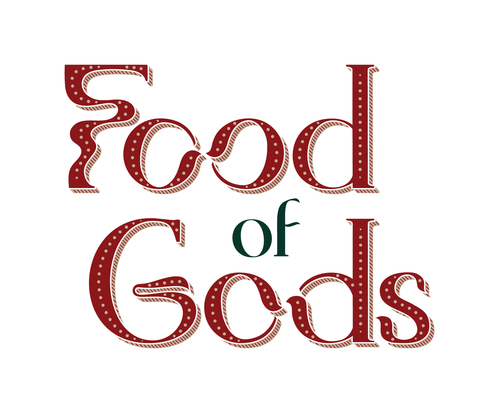
Logo Development Process


The above image showcases the extensive logo development process undertaken to create the final logo design for the brand. Each logo variation was meticulously designed with a focus on incorporating symbols that reflected the brand's core values and mission. Overall, this acts as a testament to the design process, showcasing the various steps taken to arrive at the final design. It highlights the importance of experimentation and iteration in the creative process, ultimately leading to a successful outcome.
Final Logo Variations
Primary Logotype - Detailed
Primary Logotype - Simple
Secondary Logotype - Simple
Secondary Logotype - Detailed
Monogram - Detailed

Monogram - Simple
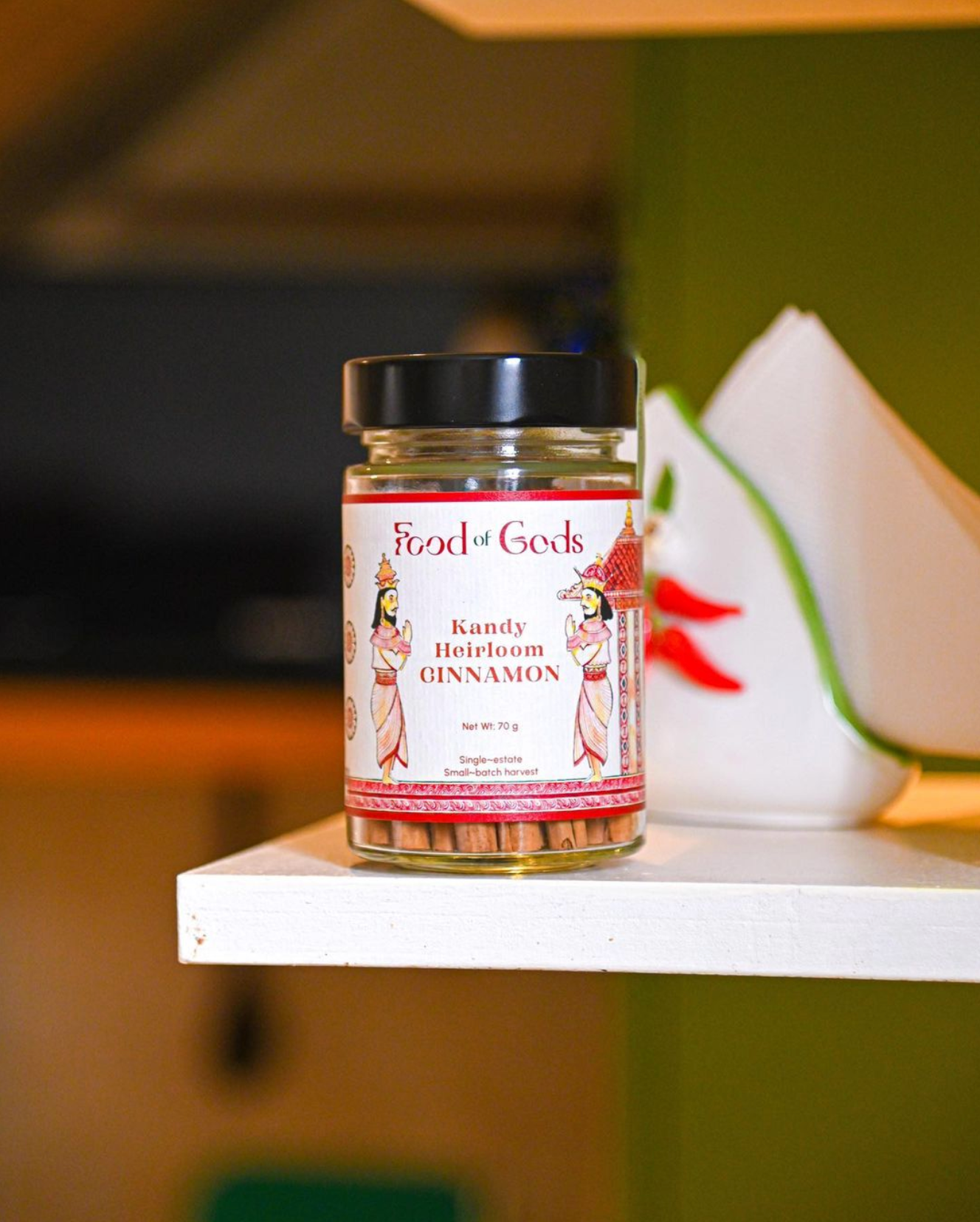
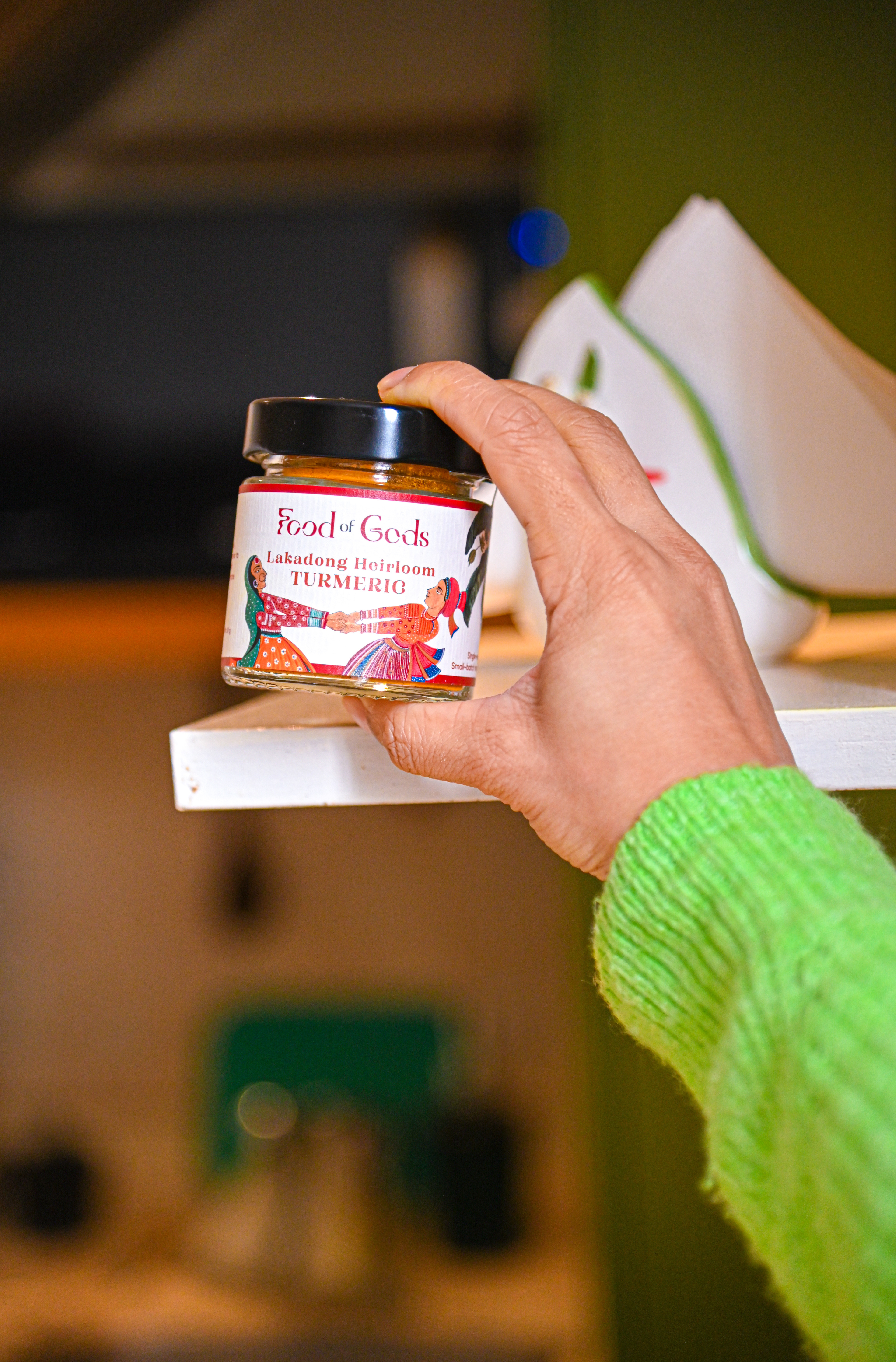
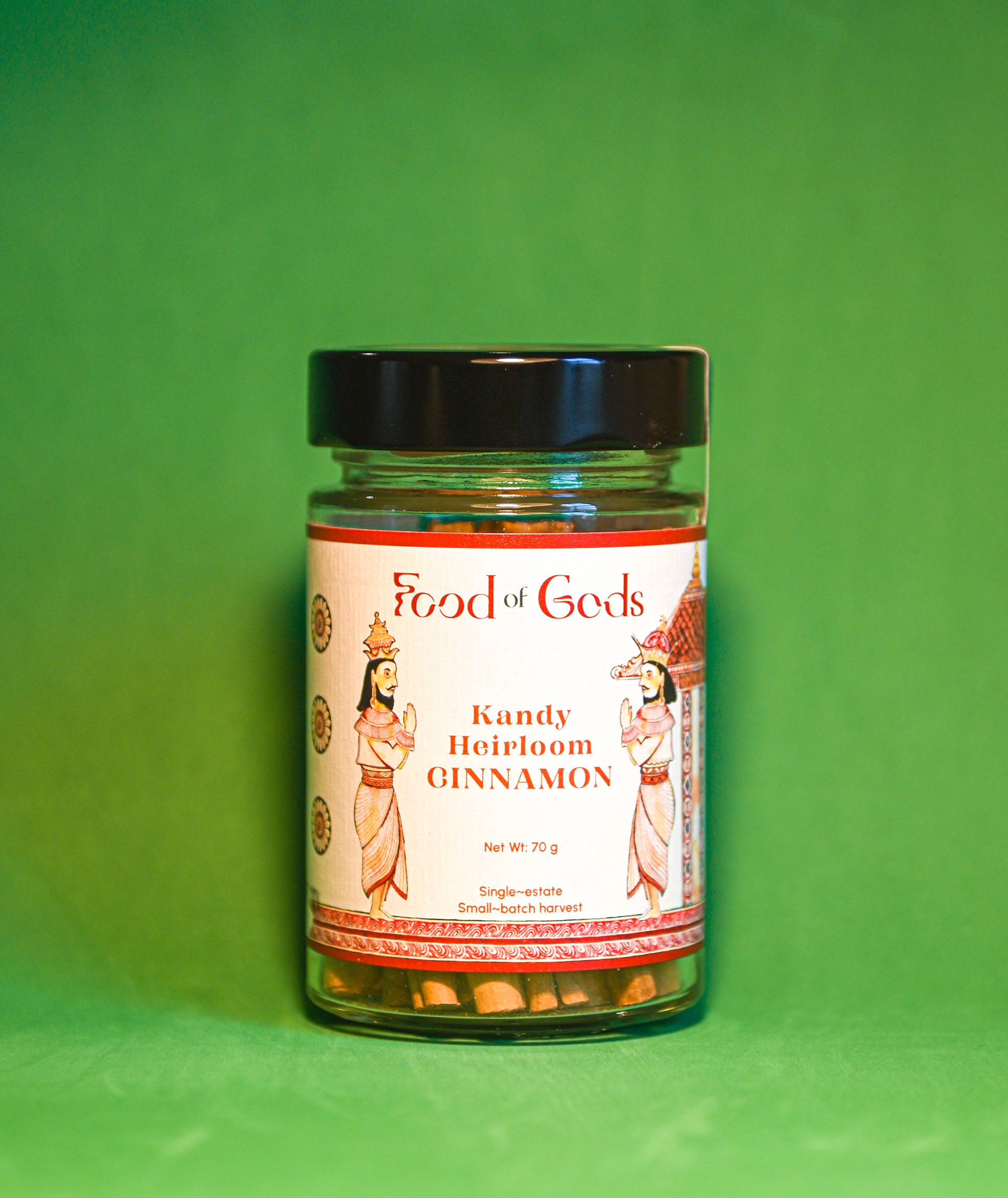
Pictured above are images of Food of God packaging using the re-designed logo